St. Patrick’s engaged Highland Creative to update their visual identity and design a new website. Over a period of several months, we engaged in an in-depth process of discovery and research, learning about the Seminary, and working closely with the leadership to understand the particular challenges, opportunities, and identity of St. Patrick’s.
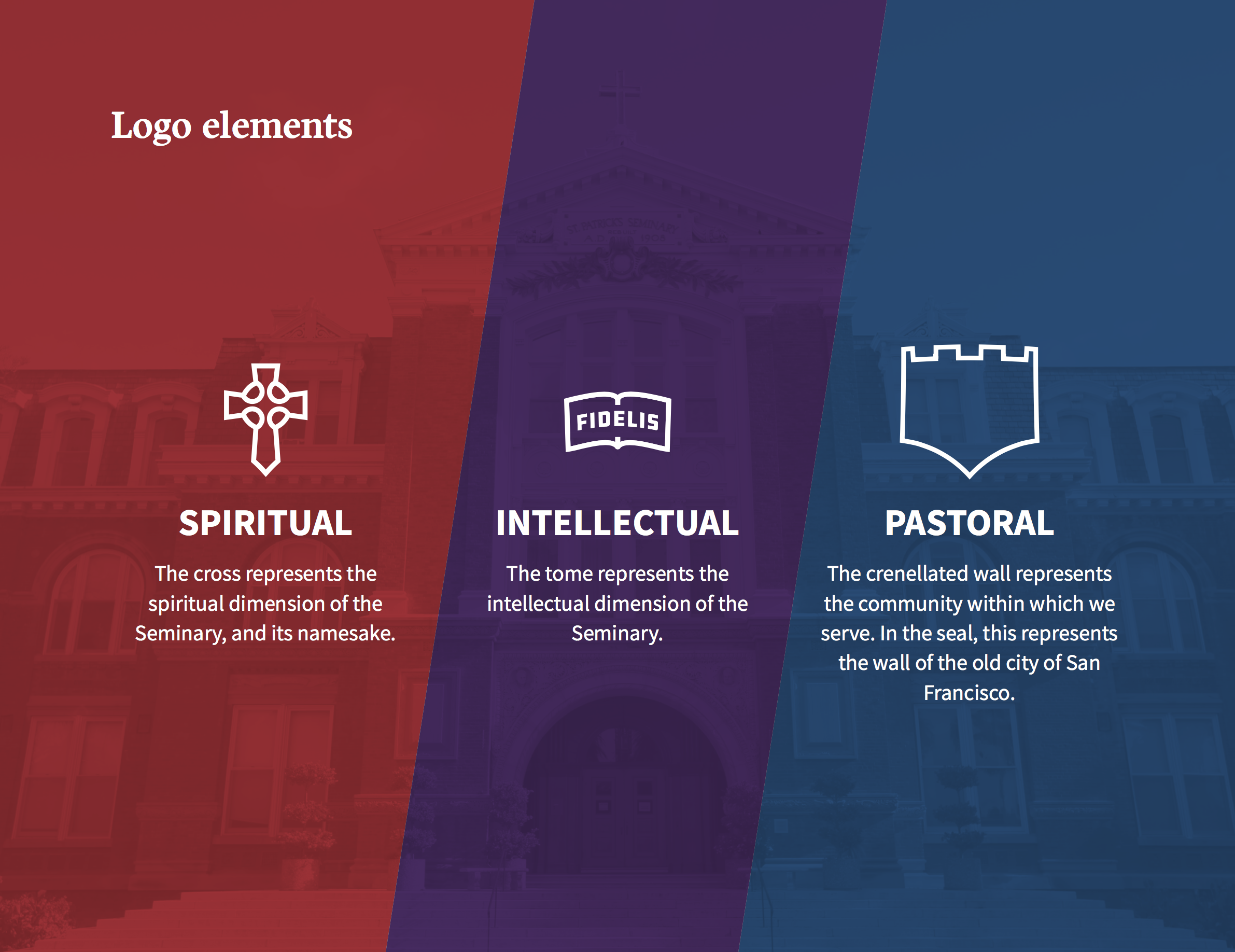
The brand identity system we developed draws its inspiration from the three core, interdependent dimensions of the formative mission of the seminary: the Spiritual, the Intellectual, and the Pastoral, or Human.
It was very important to us in this effort to base all of the decisions we made about the St. Patrick’s brand in a solid rationale. It was also important to steer well clear of any kind of trend-following or arbitrary new direction. The Seminary is an institution steeped in history and deep-rooted tradition, and we knew that it was essential to reflect that gravitas. To that end, a core part of the brand identity system remains the Official Seal, which remains largely unchanged, with some tweaks to stabilize and standardize the design.
![]()
Perhaps the most noticeable new element of the system is the new logo. This logo does not replace the seal, but serves to extend the visual brand in a way that is more flexible and adaptable to different contexts. This is especially useful in digital media. Within the logo can be seen representations of the three core dimensions of the brand. The Celtic cross represents the Spiritual dimension, and the Seminary’s namesake. The tome represents the Intellectual dimension. And the crenellated rampart represents the community within which the Seminary lives and serves. Both the rampart and the shield-like shape of the logo also provide a connection to the Archdiocese of San Francisco.
This brand foundation is also reflected in the new color palette and typography. The new palette contains the familiar green signature color, but we have extended it with an array of complementary Catholic colors.
It’s our hope that this updated brand – and the accompanying new website – will play its part in helping the Seminary continue in its crucial mission forming the priests of tomorrow.